Creating a clean CSS Comparison Table with CSS flexbox
A CSS and HTML comparison table is a powerful way to instantly convey to visitors the main features of your offerings, plus how they differ. Often times comparison tables and pricing tables are said in the same breath. To me, a comparison table is different in that it should contain an extra column listing all the available features. This makes it easy to compare the plans and isolate what's different about them.In my last tutorial, I showed you how to create a CSS pricing table using the power of CSS flexbox. Well, I'm back to demonstrate how to create a minimalistic comparison table using the same. The end result is a responsive compare table with clean markup that's both responsive and easy to customize:
- Office Chairs
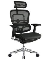
Eurotech
Hbada
Zenith
Amazonbasics
- Weight
- 25kg
- 13kg
- 17kg
- 28kg
- Cost
- $$
- $
- $$
- $
- Delivery
- Domestic
- International
- International
- Domestic
- Verdict
- Best Chair for Back Pain
- Best budget chair
- All Mesh for Cooling
- Only Chair with Top Grain Leather
The HTML Markup
For the markup, I'm striving to make it as clean and minimalistic as possible. I settled with using an outer main DIV element, followed by a series of UL lists to render each"row" of content within the comparison table:
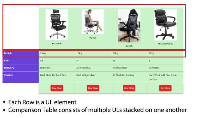
The comparison table is essential made up of multiple ULs stacked up against one another. I'll use CSS flex box to make them all equal width and expand and contract at the same rate, so they behave similarly to rows in a table.
<div class="comparisontable">

	<ul class="row">
		<li class="legend">Office Chairs</li>
		<li><img src="Eurotech-chair.jpg" /><br />Eurotech</li>
		<li><img src="Hbada-chair.jpg" /><br />Hbada</li>
		<li><img src="Zenith-chair.jpg" /><br />Zenith</li>
		<li><img src="amazonbasics-chair.jpg" /><br />Amazonbasics</li>
	</ul>

	<ul class="row">
		<li class="legend">Weight</li>
		<li>25kg</li>
		<li>13kg</li>
		<li>17kg</li>
		<li>28kg</li>
	</ul>

	<ul class="row">
		<li class="legend">Cost</li>
		<li>$$</li>
		<li>$</li>
		<li>$$</li>
		<li>$</li>
	</ul>

	<ul class="row">
		<li class="legend">Delivery</li>
		<li>Domestic</li>
		<li>International</li>
		<li>International</li>
		<li>Domestic</li>
	</ul>

	<ul class="row">
		<li class="legend">Verdict</li>
		<li>Best Chair for Back Pain</li>
		<li>Best budget chair</li>
		<li>All Mesh for Cooling</li>
		<li>Only Chair with Top Grain Leather</li>
	</ul>

	<ul class="row">
		<li class="legend"></li>
		<li><a href="" class="calltoaction">Buy Now</a></li>
		<li><a href="" class="calltoaction">Buy Now</a></li>
		<li><a href="" class="calltoaction">Buy Now</a></li>
		<li><a href="" class="calltoaction">Buy Now</a></li>
	</ul>

</div>
The first LI element within each UL is the feature/legend. To easily isolate and style them differently from the rest of the pack, I've given those LI elements a CSS class of "legend".
The CSS:
Now comes the fun part- turning the markup into a comparison table. Using CSS Flexbox, it's relatively easy to transform UL elements so they are horizontal in layout, flexing and stretching in concert so they behave more like table cells.
I've removed some of the unnecessary lines so you can focus on the important bits below:
div.comparisontable{
	display: flex;
	flex-direction: column; /* turn children ul elements into stacked rows */
}


div.comparisontable ul.row{
	list-style: none;
	display: flex; /* turn children li elements into flex children */
	flex: 1;
	flex-wrap: wrap;
}

div.comparisontable ul.row li{
	background: #c9f4ca;
	flex: 1;
	padding: 10px;
	border-bottom: 1px solid gray;
}

/* the legend column (first li within each row) */
div.comparisontable ul.row li.legend{
	background: #6640d8;
	color: white;
	border: none;
	width: 200px;
	border-bottom: 1px solid white;
}

/* very first row */
div.comparisontable ul.row:first-of-type li{
	text-align: center;
}

/* very last row */
div.comparisontable ul.row:last-of-type li{
	text-align: center;
	border-bottom: none;
	box-shadow: 0 6px 6px rgba(0,0,0,0.23);
}


/* first and last cell within legend column */
div.comparisontable ul.row:first-of-type li.legend.legend,
div.comparisontable ul.row:last-of-type li.legend{
	background: transparent;
	box-shadow: none;
}
The "feature list" or legend column is the first LI element of each row. It
has an explicit width of 200px, unlike the other LI elements that are flex
width (flex: 1).Making the Comparison Table Responsive
Right now the comparison table isn't responsive. That is to say, the "columns" within each row remains side by side even as the screen size becomes very small.
In CSS flex box, we can easily change the display order of flex children elements from the default "side by side" behaviour, to "stacked one on top of the next", by setting the flex-direction property from "row" to "column".
Right now in my comparison table, the UL elements themselves are stacked, though the children LI elements appear side by side like cells in a table. I'll change them to be stacked as well when the screen gets sufficiently small:
@media screen and (max-width:650px){

div.comparisontable ul.row{
	flex-direction: column;
}

div.comparisontable img{
	width: auto;
	height: auto;
}

div.comparisontable ul.row li{
	margin-right: 0;
	width: auto;
	flex: auto;
}

/* first and last cell within legend column */
div.comparisontable ul.row:first-of-type li.legend.legend,
div.comparisontable ul.row:last-of-type li.legend{
	display: none;
}

div.comparisontable ul.row li.legend{
	width: auto;
}
}
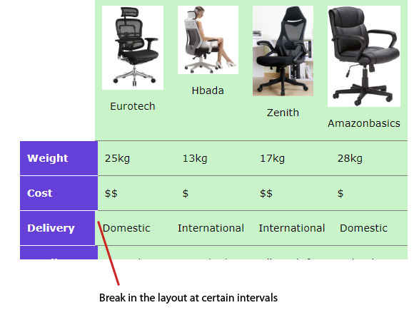
Now when I resize the window down, the comparison table collapses and each "cell" appears on its own line:
Known Issue
Last but not least, there is a small known issue with the comparison table. When you resize it, at certain intervals, the width of some of the LIs become out of sync a little bit:
If you know the solution to this, please send me an email (ergonomictrends [at] gmail.com).
Author Bio: This post was contributed by Jon Muller, where he blogs about the latest ergonomic trends and products.
